Updating the blog to Bootstrap 3
2015 Aug 15 -
It seems that every July or August I get the sudden urge to blog and this year appears to follow that trend. I think my primary reason to not write more is that making posts is annoyingly awful. Sure, I could write blog as a bunch of HTML pages, but I really hate writing pure HTML. On the flip side, I could use a full-fledged blogging platform like WordPress (or any of the other top 20 blogging platforms for 2015, but with these platforms you frequently lose control over your content (seriously, read the TOS on these websites!). Neither one of these options is very desirable in 2015.
Fortunately, there is a middle ground. Static site generators let you build your website locally in some nice language, like MarkDown, and deploy it to a remote server as a bunch of static HTML files. These generators often apply common page elements like navigation and CSS which dramatically reduces the amount of overhead involved in writing a blog post.
Back in 2012 I elected to try out Jekyll a static
site generator that lets you write not only blog posts, but also an entire
website in MarkDown.
Jekyll is pretty awesome in its own right, but because GitHub supports it via.
their GitHub Pages you can make your entire
website within a git repository and deploy it with a simple git push!
In order to apply a theme to my website I elected to use
Jekyll Bootstrap because it offered a very simple,
fast deployment strategy and a nice configurable theme via.
Twitter Bootstrap.
I went from nothing to blog within 3 minutes. It. Was. Awesome!
Come 2015 everything has gone mobile and I simply didn’t have time to figure out how to hijack my Twitter Bootstrap 2.0 theme into something that would be mobile-friendly. Luck would have it that there is a Bootstrap 3.0 variant of templates for Jekyll named Jekyll Bootstrap 3. I had already some experience with Bootstrap 3 in designing a new website for CHARA so I decided to go for it.
Fundamentally probably could have just checked out a copy of Jekyll Bootstrap 3 and moved my pages over to the new website, but I wanted to bring my content up to date with modern standards. With this I embarked on a short journey learning some new features in Jekyll, better ways of displaying images in a responsive fashion, and some cool CSS to improve the appearance of this website.
Getting the new Jekyll Bootstrap 3
This was, by far, the easiest thing to do. Simply check out the GitHub repository to a local directory and start editing:
git clone https://github.com/dbtek/jekyll-bootstrap-3 USERNAME.github.io
cd USERNAME.github.com
git remote set-url origin git@github.com:USERNAME/USERNAME.github.io.git
git push origin master
Add custom CSS
This one was trivial. To add custom CSS, simply create a /css/main.css
file and modify the head section of Bootstrap 3’s default template (located
in the _include/themes/bootstrap/ directory) to include your stylesheet.
Updating figures
Many of my blog posts and pages feature images that I was floating and
captioning using div and style properties.
Unfortunately, the images were not responsive to changes in page size
and the captions often were too large for the figure.
There had to be a better way!
The solving the first problem is trivial thanks to the new img-responsive
class in Bootstrap 3 (see the image
documentation).
To make your images dynamically resize is now trivial: simply apply
the img-responsive class to the image like this:
<img src="..." class="img-responsive" ... />
You can even add a nice border around the image via. the img-thumbnail class:
<img src="..." class="img-responsive img-thumbnail" ... />
The next trick was to get the captions to match figure sizes. After much
Googling and trying several solutions I found the answer over at
Stack Overflow.
It consists of using the <figure> environment along with the <figcaption>
tag.
After have these elements you apply some custom CSS to the tags to your
/css/main.css file:
figure {
   background-color: #f8f8f8;
   padding: 5px;
   font-size: .875em;
   display: table;
}

figure img {
    display: block;
    width: 100%;
}

figcaption {
    display: table-caption;
    caption-side: bottom;
    background: #f8f8f8;
    padding: 0 10px 10px;
}
And you end up with a pretty nice result

Thanks to a page over at HTML5Doctor
I found out you can even put multiple figures side by side within a figure
environment, you just have to float them.
For example, if you want two figures side by side, simply style the images with
<img src="..." class="..." style="float: left; width: 50%; /> as shown
below:
Best of all, thanks to the img-responsive tag the images will automatically
scale with the browser window.
Annoyingly I couldn’t get the code for these figures to display within a `````
tag, so just look at the source to see how this works.
Add data-driven, two-level menu navigation
The next step was to refurbish the navigation menu.
In Jekyll-Bootstrap 2.0 use the group section of the
YAML front matter to put pages
into the navigation section.
In order to get the pages sorted I had to resort to some tricky Liquid
voodoo in order to parse the pages out into top and sub-level navigation
menus.
This was quite flaky and I kept forgetting how to add pages correctly, so
I ended up abandoning it all together and just going for top level menus with
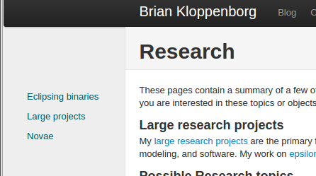
a floating submenu navigation bar on the left.
The results were, shall we say, less than desirable:
Again, back to Google for ideas. I tried a few solutions including a fairly novel idea of parsing the page URLs to make the menus, but in the end it didn’t quite give me what I wanted. After reading about Jekyll data files I searched for a demonstration that data files were supported on GitHub. Fortunately Dale Tournemille had already written a post discussing how to create navigation from data files.
The process is quite simple.
First you create a YAML file containing the navigation menu you wish to create
and place this in the _data directory. Here is a snippet from my
_data/navigation.yml file:
- title: "Home"
  href: "/"

- title: "Blog"
  href: "/blog/"
  subcategories:
    - subtitle: "Most recent"
      subhref: "/blog/"
      subhref: "/blog/categories.html"
    - subtitle: "List by tag"
      subhref: "/blog/tags.html"

- title: "Research"
  href: "/research/"
  subcategories:
    - subtitle: "Publications"
      subhref: "/research/publications.html"
    - subtitle: "CV"
      subhref: "/research/Kloppenborg_CV.pdf"
    - subtitle: "epsilon Aurigae"
      subhref: "/research/epsilon-aurigae"

- title: "My Software"
  href: "/software/"

- title: "Contact"
  href: "/contact.html"
The contents of this file will be accessible via. the site.data.navigation
variable.
Next I extracted the core of the navigation template from Dale’s website
and pasted it into my
_include/navigation
file and made a few minor modifications.
Finally, we need to call the navigation script when we generate the pages.
This is easily accomplished by modifying the Bootstrap 3 default theme
(i.e. the _include/themes/bootstrap/default.html file) by replacing the
call to JB/pages_list with our own navigation page:
{% raw %}
Comment out these lines:
  {% assign pages_list = site.pages %}
  {% include JB/pages_list %}
And replace with this:
  {% include navigation %}
{% endraw %}
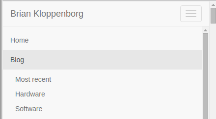
The result? Much better looking navigation menus that intelligently respond to changes in screen size:

Move the blog to a sub-directory
Next I wanted to move my blog posts into the blog sub-directory.
Fortunately this is trivial to do.
Open up the _config.yml file and prefix /blog onto the permalink like so:
permalink: /blog/:categories/:year/:month/:day/:title
Custom blog category pages
While browsing other Jekyll blogs I stumbled upon the
blog at gladis.org.
One really nice feature there is the ability to click on the categories and
be taken to a page which list all blog posts under that category.
I thought this was an automatic feature of Jekyll, but evidently it is not.
There were lots of solutions for how to do this including a fairly nice
solution using templates by Christian Specht over at
Stack Overflow;
however, this split tags with spaces which was an undesirable consequence of
their sorting method.
In the end I just adopted the simple method of parsing the site.categories
array for a specific tag and inserting that as a HTML file.
You can see a sample implementation of this method
for my software category page.
The next step was to apply a theme to clean up the appearance of the dates
in the category list.
Again, I returned to gladis.org and inspected their
source code.
The most important change was forcing the font to be mono-space, beyond that
the remaining changes to CSS were just cosmetic.
Thus I added the following lines to my css/main.css file I created above.
ul.posts {
  list-style-type: none;
  margin-bottom: 2em;
}

ul.posts li {
  line-height: 1.75em;
}

ul.posts span {
  color: #aaa;
  font-family: Monaco, "Courier New", monospace;
  font-size: 90%;
}
Improving the tag page
My final change was improving the way the tags page displayed. In my old blog I found some code that changed the styling so that tags appeared in a tag wall rather than an unordered list. I don’t remember where I found the code, so I’ll just point you to my blog/tag.md file.
The code consists of two primary blocks.
The top block simply creates a list of tags (in no particular order) with
the CSS class tag-box (see below) and the bottom block of code simply prints
all posts with that specific tag.
To give the tag list a nice look I added a little bit of custom CSS which collapse the unordered tag list into small gray boxes:
.tag-box {
	list-style:none;
	margin:0;
	padding:5px 0 ;
	overflow:hidden;
}
.tag-box li {
	line-height:28px;
}
.tag-box.inline li {
	float:left;
}
.tag-box a {
	padding: 3px 6px;
	margin: 2px;
	background: #eee;
	color:#005F6B;
	border-radius: 3px;
	text-decoration:none;
}
.tag-box a span{
	vertical-align:super;
	font-size:0.8em;
}
.tag-box a.active {
	background:#57A957;
	border:1px solid #4C964D;
	color:#FFF;
}
Edit: I later remembered that I also had to update the
_includes/themes/bootstrap/post.html page to use the tag-box class rather
than tag_box.
The end result
In the end converting my blog from Jekyll Bootstrap 2 to Jekyll Bootstrap 3 took the better part of a day. Most of this time was researching how I could make some minor modifications due to the limitations imposed by Jekyll’s Liquid templating engine. My website is now mobile friendly and I fixed several small things that were bothering me about is layout and navigation menu. Whether or not these changes will be enough to keep me blogging on a more routine basis remains to be seen…
Fixed navigation menu
To make the navigation menu remain fixed at the top of the page we simply
need to consult the
Bootstrap 3 documentation.
This is pretty easy, simply modify the _includes/themes/bootstrap/default.html
template file by adding navbar-fixed-top to the nav element tag and
specify that there needs to be a little extra space on the top of the body
in the css/main.css file:
body {
    padding-top: 50px;
}